Crocodile Banner Study
In a continuing effort to improve my artwork, I’m studying the work of some of my favorite artists. Next up: Justin Chan!
I probably first saw Justin's work through Nuclear Throne promotional material. He has a loose style, uses vibrant colors, and draws cool subjects. The compositions are fun and pull you in.
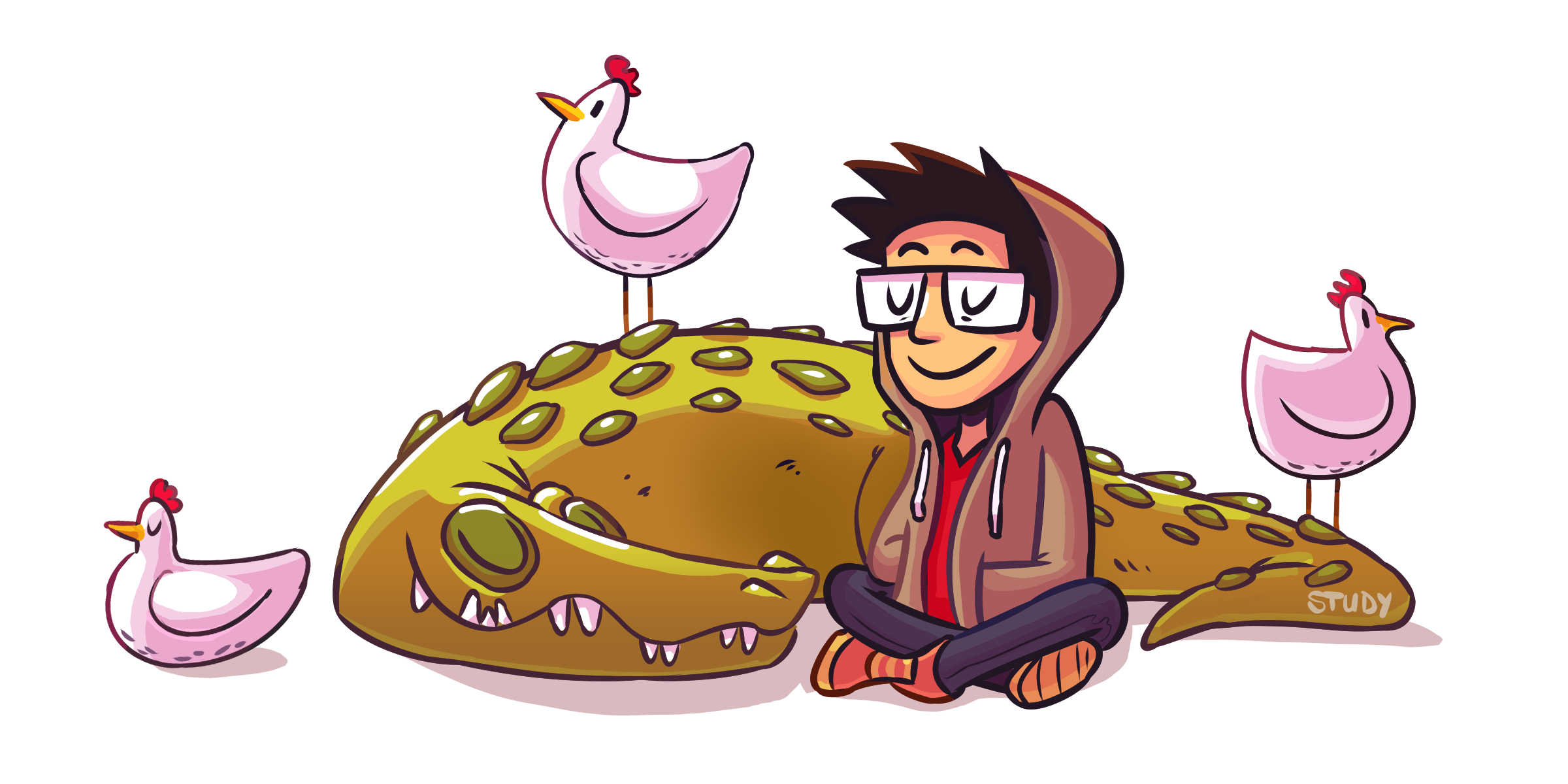
This crocodile banner in particular jumped at me:
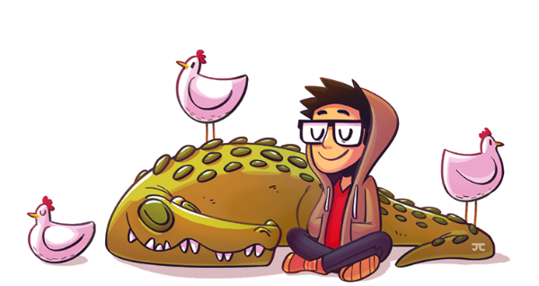
It’s a delight to behold and looks simple enough that it didn't feel out of reach for me to study.
While studying, I noticed some smart decisions:
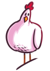
- All three chickens are positioned in side profile, making them easier to draw (this also creates a satisfying pattern).
- Hands, which are notoriously difficult to draw, are hidden: hands are tucked into the hoodie and the crocodile's limbs are positioned behind other elements. Even chicken feet are obscured by chicken feathers or lizard skin. Clever choices.
- Faces (also difficult to draw) are minimized via closed eyes and/or glasses.
Smart! I hadn't really noticed these things at first. As a person who often struggles with hands, I especially appreciated these decisions while doing the study:
Fortunately this style is close to my own with thick lines, simple shapes, and a limited palette. Coloring the lines is something I normally neglect, but it adds another level of polish and emphasizes the lighting. Justin’s piece also has more gradients and texture than I normally put into mine -- they look great and add warmth.
Something evident from this study is that I need to work on the quality of my linework. Justin’s lines are so fluid and effortless, while mine look stiff and labored by comparison. This is very helpful: it shows that I need to pay more attention to stylus pressure and revisit my lineart brush.
Next I wanted to use the crocodile scene as a kind of seed to plant and see what grows:
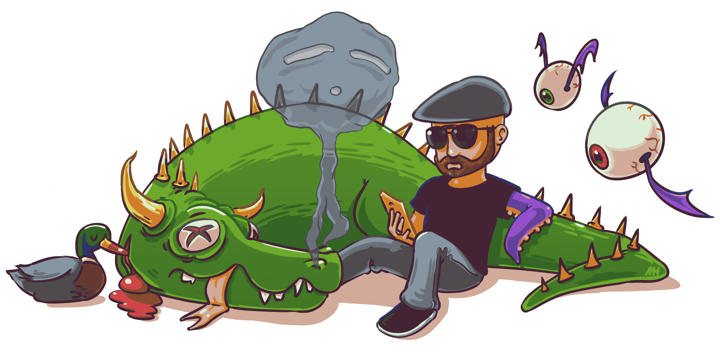
I included the source's core components as a base but with my own twists, including:
- The left chicken became a murderous duck.
- The crocodile became a dead dragon.
- The top chicken turned into smoke from the dragon's nostrils.
- The right chicken split into two eyebats.
- Oh, and I'm there now ... but I suck at relaxing, so instead of happily meditating or something, I'm reading (probably an article on game design).
This was a fun study and I learned a lot from Justin's cool animal hangout. You can find more of his work all over the place:
Also feast your eyes on the Previous Blog Banners. There are more crocodiles and chickens and they get even more detailed and beautiful over time. Really cool to see the progression!