Demon Seed Pixel Art Process
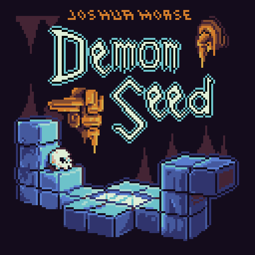
This is the cover to Demon Seed, a HOT new Castlevania 3 remix by one of my favorite musicians, Joshua Morse.
When I make art for Joshua, I'm always intimidated because my design needs to "sit on the same shelf" as his amazing music. To make it the best it can be, I take as much time as I can and put the design through its paces.
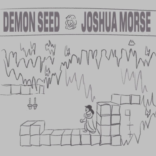
First I wanted to just start sketching to loosen up. Rather than going with whatever nonsense might be in my head, I went straight to the source and doodled a level from Castlevania 3.
This was not the direction we decided to go, but that's good information to have.
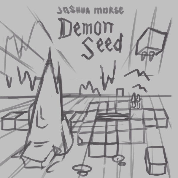
For the next sketch, I wanted to keep some of the elements that I liked drawing and looking at from the first sketch. Spikes, cubes, maybe some bats -- it looks more three-dimensional and it still felt like a Castlevania level.
One fear of mine is that I'll forget I'm working on pixel art and try to bite off more than I can chew. High resolution pixel art is time-consuming and difficult to pull off, so I wanted to try a quick pixel rough to see where this was headed.
Coloring and shading are important for a piece like this, so I continued on to ensure things weren't getting out of hand. Sure enough, as I colored I was seeing signs that the resolution was too high for me to handle with the time I had. I'd need to use a smaller canvas, which meant fewer elements and a simpler environment would be best.
Also, the words "Demon Seed" are so cool but look a little lost in this iteration. More emphasis on the title would benefit the design.
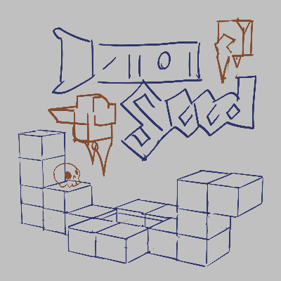
After having gone through some paces, I had a good idea of what I could and wanted to make. The title would have a bigger role, which takes pressure off of the environment. The blocks stayed, along with some floating spikes and a skull because, ya know, Castlevania. I blocked everything out and it felt reasonable.
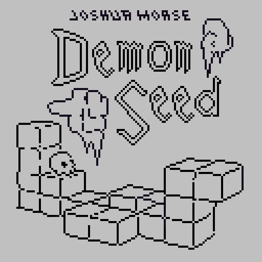
Next I began to render the pixels. I could tell immediately that the resolution was more my speed and at this size I'd be able to make a better overall design.
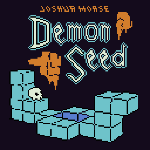
Lastly I added the first pass of color. It looks anemic at this stage, but at low resolutions the detail can really shine, so I went straight into shading and polish.
You can see the final cover above, on DeviantArt, or on PixelJoint.
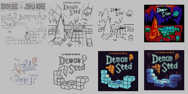
Here's the entire process. The end result is not as good as VLAD II but here we are. If I could do anything differently, I would have added more detail like creatures and treasure scattered around the blocks. Make it feel mossy by covering the surfaces ...
Now that I think about it, this Demon Seed piece came before Happy Surfaces, and could have unconsciously laid the groundwork for it! More on that later.